3. Outputs
3.1. General structure
In general, you always get the excel data sheets for your model which you created, and you can analyze plots which are generated too. It is helpful to save the output after running the model, as it could be overwritten by refreshing the page or if an error occurs.Fig. 3.1 show the structure of the output.
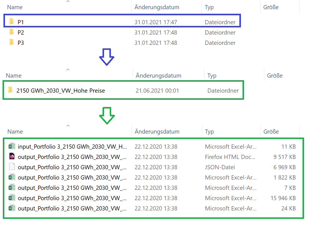
Fig. 3.1 Possible output when creating many portfolios and the corresponding sub folders
3.2. Structure in detail
Depending on the mode you chose, the output varies a little bit concerning the structure. See the subchapters below for detailed information or go straight to the extra chapters for more information on the rest when picking these modes.
3.2.1. Input Excel File
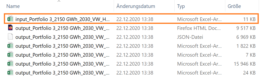
Fig. 3.2 Input excel file which will be created for output
As displayed in Fig. 3.3, the structure of the input file, which will be generated, is the same as already mentioned in The Web User Interface. There you will find all the input parameters you put in the model for calculation.
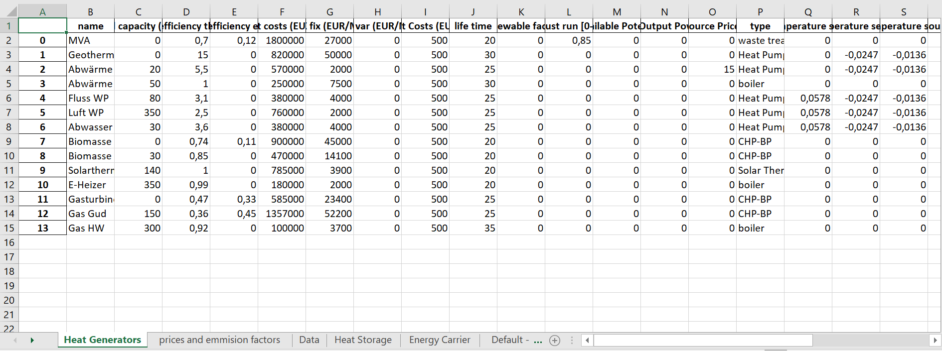
Fig. 3.3 Input excel file structure
3.2.2. Output HTML File
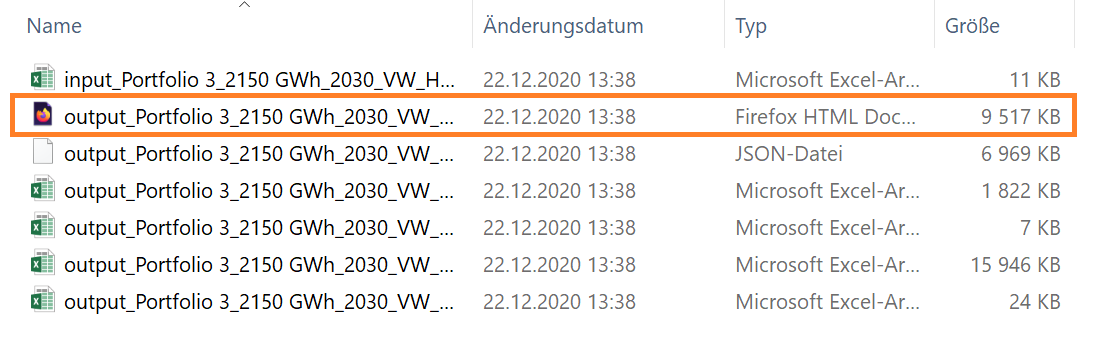
Fig. 3.4 Output HTML file which will be created for output
If you open the HTML file, you find various analyses of the calculation and different graphs. Like Fig. 3.5 shows, you have some options where you can take a closer look to the results. Fig. 3.6to Fig. 3.6then shows the graphs for the first option, the Thermal Power Energy Mix. If you want to filter the results, you can click in the legend on the functions you don’t want to see in the graph, and it will get grey in the legend and disappear in the graph, see Fig. 3.7 for instance. This option you also have for the other graphs which have a legend beside, like comparing Fig. 3.9 and Fig. 3.10.
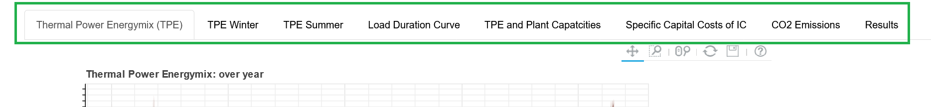
Fig. 3.5 Output HTML file options
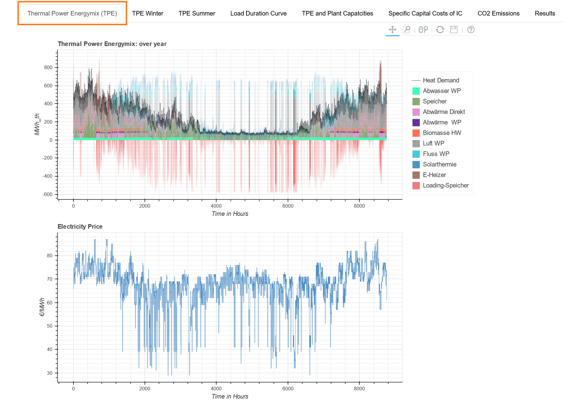
Fig. 3.6 Energy mix and electricity price
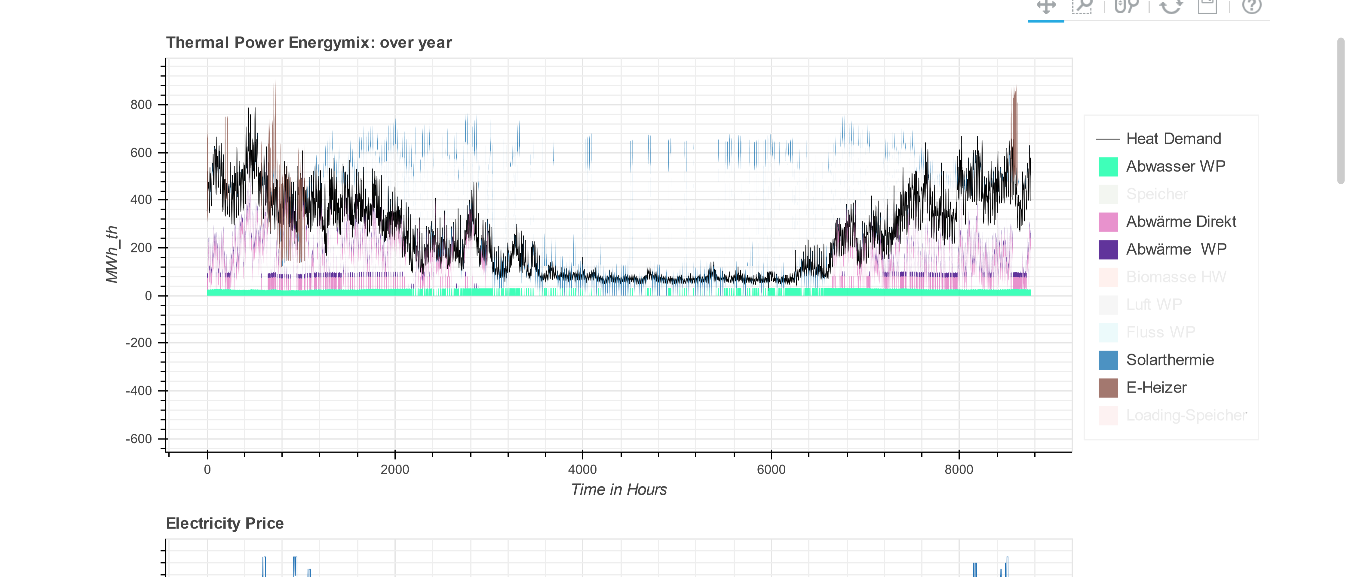
Fig. 3.7 Filtering options through the legend
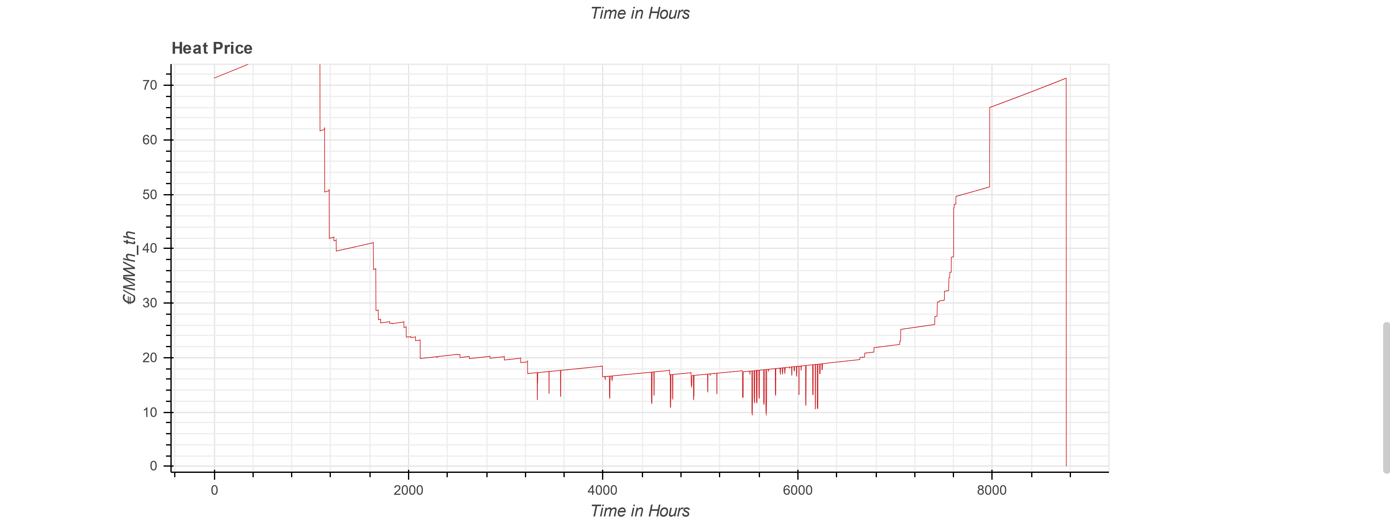
Fig. 3.8 Output HTML file - heat price graph
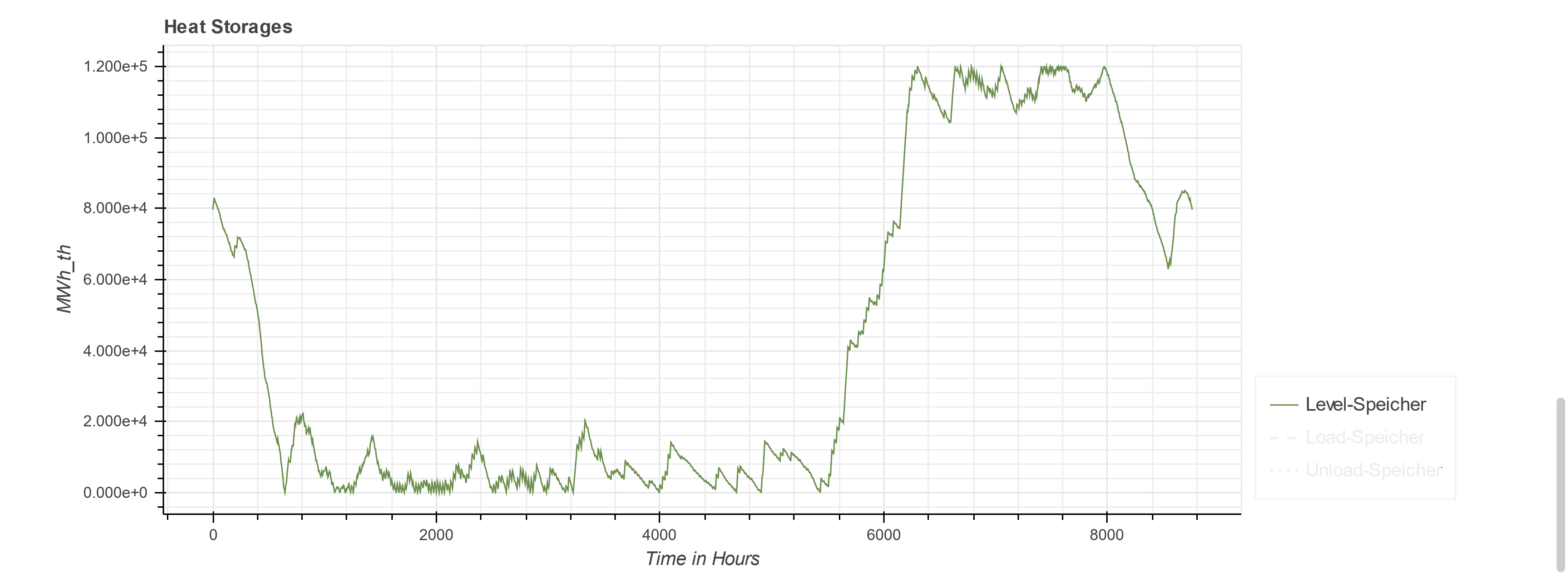
Fig. 3.9 Filtering option for heat storages - one function visible
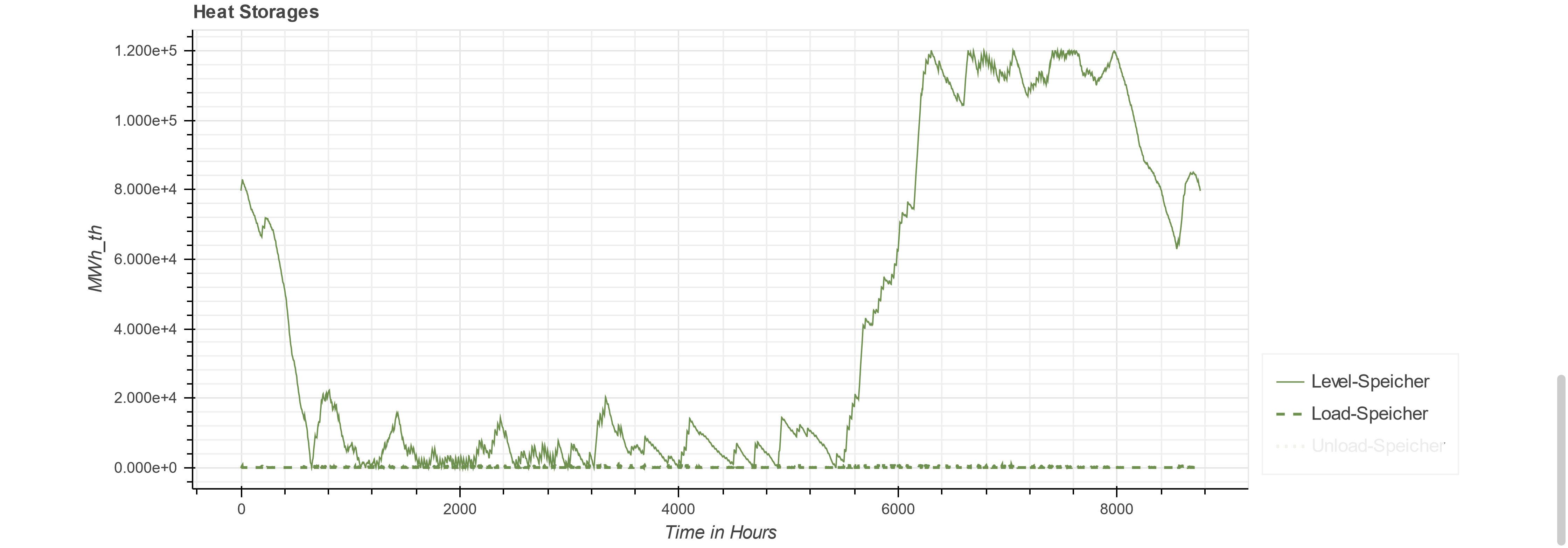
Fig. 3.10 Filtering option for heat storages - two functions visible
Other sections which have the same graphs, are the TPE for summer and winter, specifically, if you like to filter for seasonal data.
The next section, where different graphs are used, is the Load Duration Curve section, see Fig. 3.11.
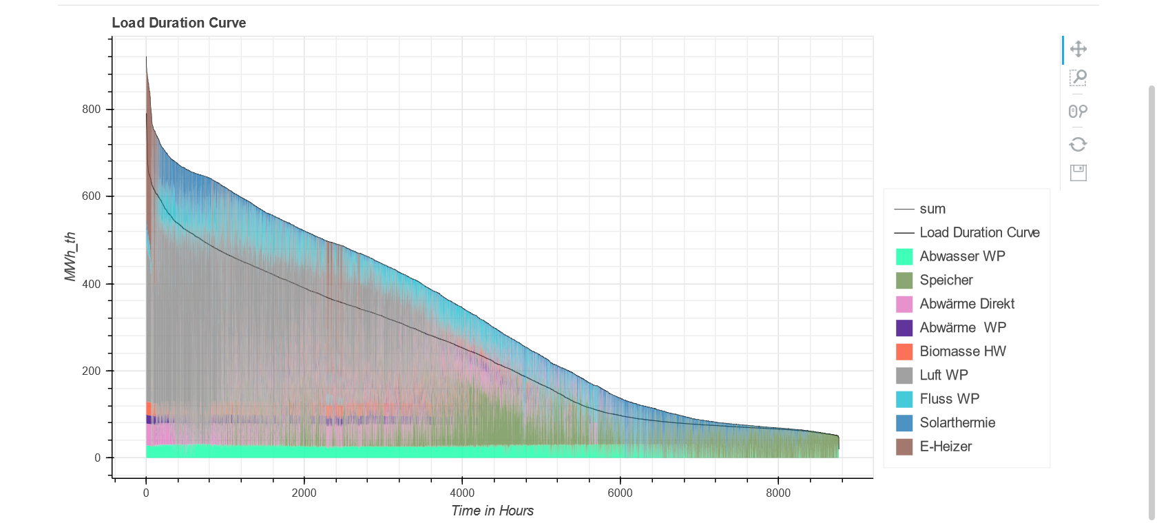
Fig. 3.11 Load duration curve graph - also filter possibilities
The following figures ( Fig. 3.12 to Fig. 3.15) show the output pie charts of TPE and plant capacities. Every pie chart has a corresponding bar chart on the right side, like the example in Fig. 3.13 shows, and also filtering options like described before.
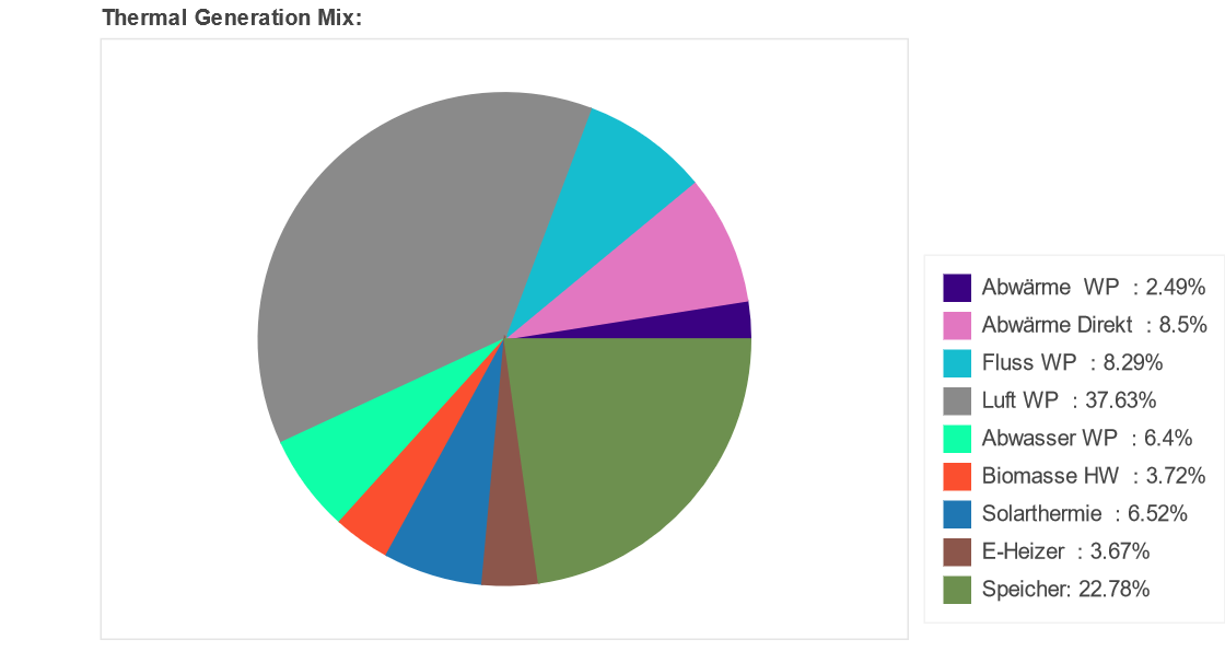
Fig. 3.12 Pie chart for thermal generation mix
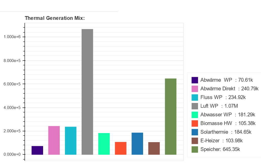
Fig. 3.13 Bar chart for thermal generation mix
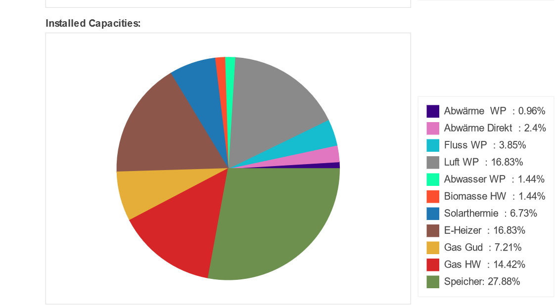
Fig. 3.14 Pie chart for installed capacities
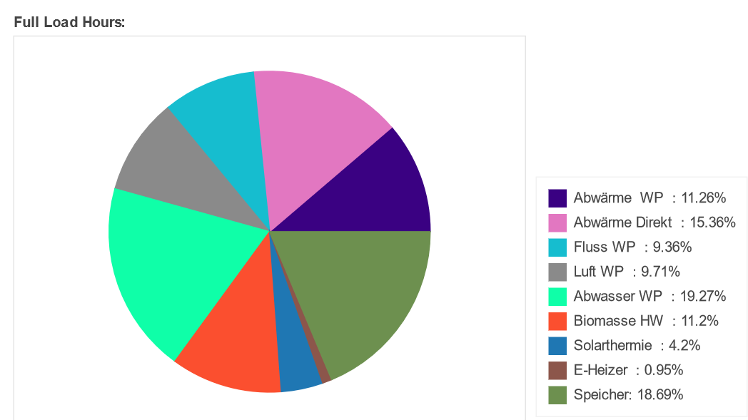
Fig. 3.15 Pie chart for full load hours
The section Specific capital costs of IC shows details about the costs through a bar chart and a corresponding table underneath the chart, like shown (here seperately) in Fig. 3.16 and Fig. 3.13.
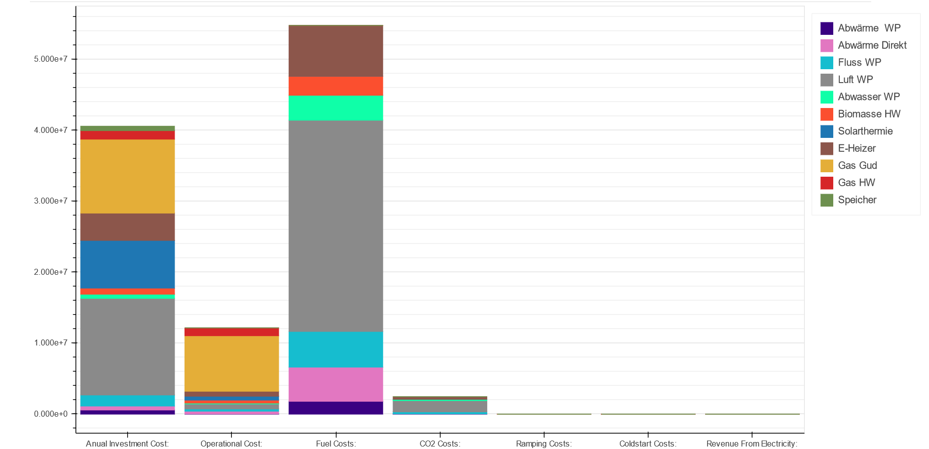
Fig. 3.16 Bar chart for cost details
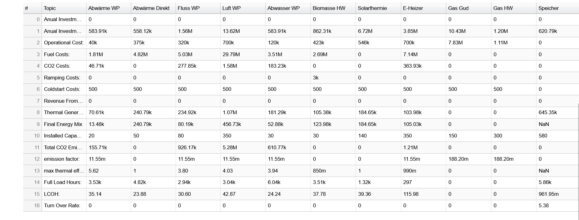
Fig. 3.17 Table for cost details
The last two sections contain on the one hand all details for the \(CO_2\) emissions, Fig. 3.18and Fig. 3.19, and on the other hand a summary of the results through a table, see Fig. 3.20.
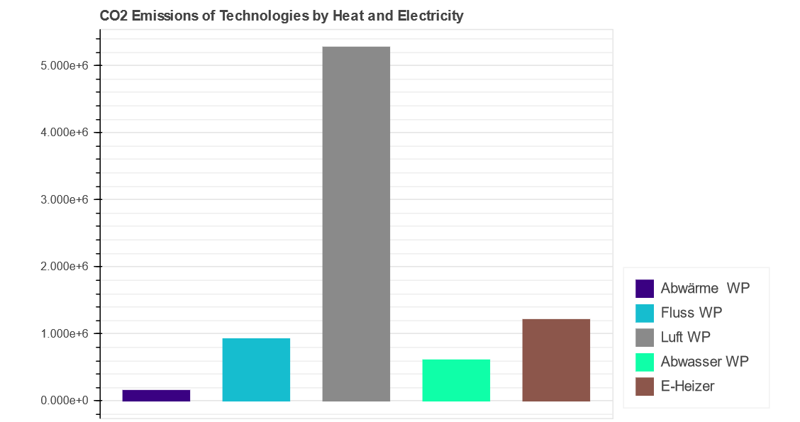
Fig. 3.18 Bar chart for \(CO_2\) emissions
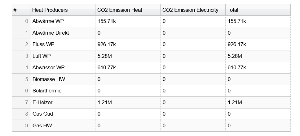
Fig. 3.19 Table for \(CO_2\) emissions
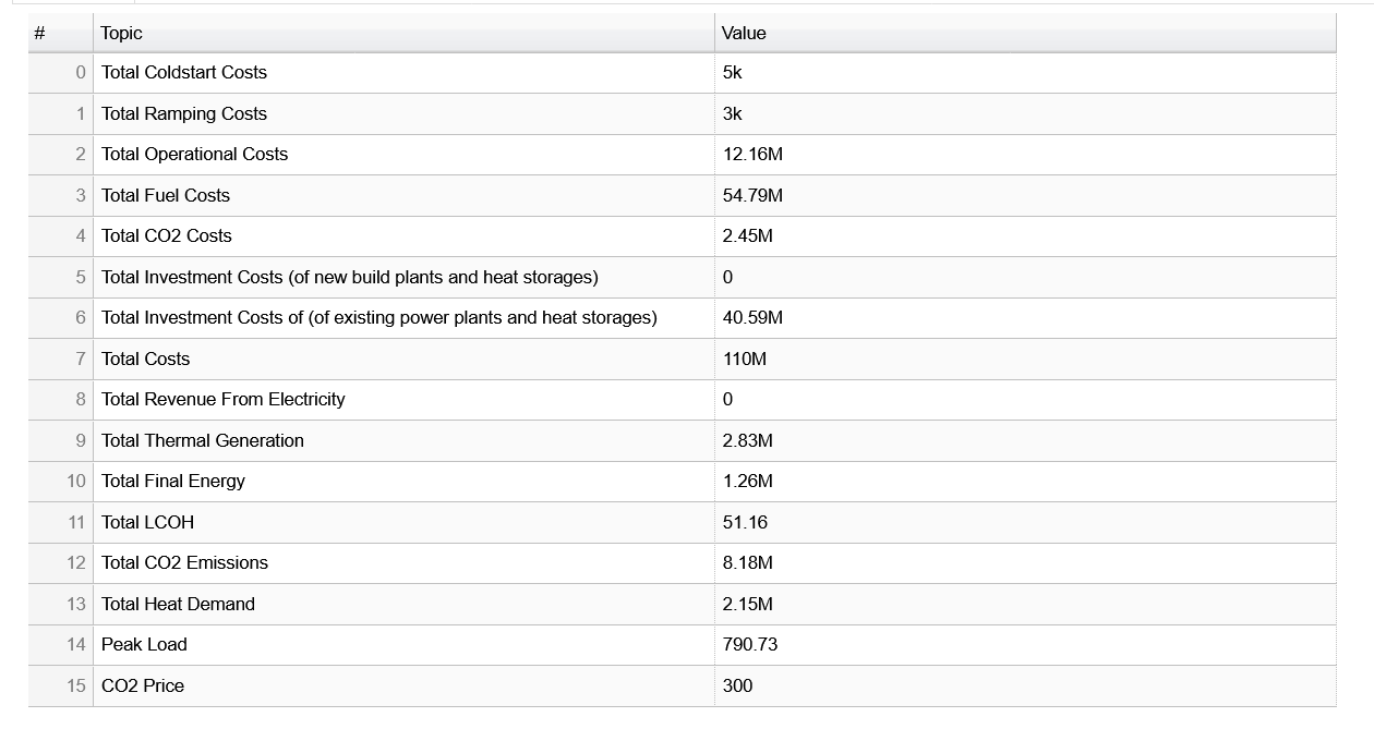
Fig. 3.20 Table for total results
3.2.3. Output Excel Files
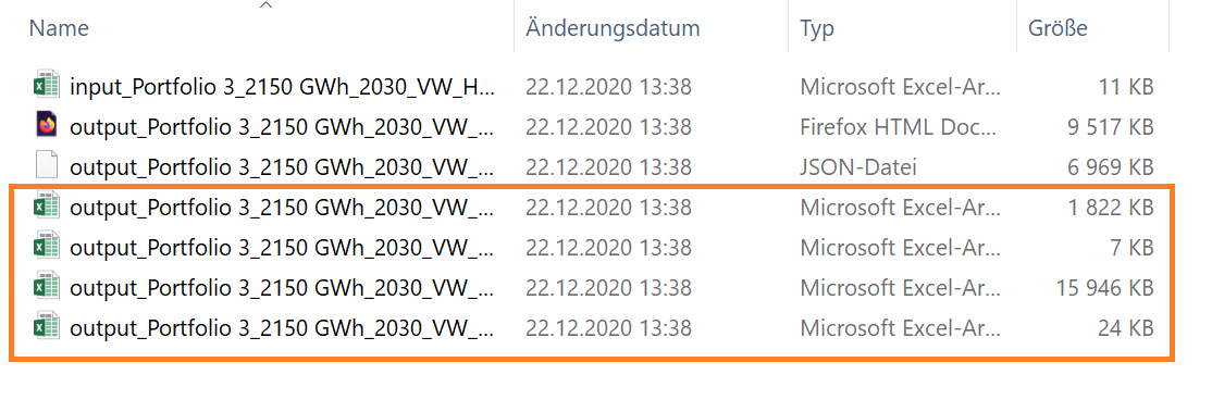
Fig. 3.21 Output excel files which will be created for output
Depending on the variety of sensitivities you made, you get different number of output excel files. For example, like shown from Fig. 3.22 to Fig. 3.26, you can easily filter values, heat generators, time or topic to filter the necessary values for you. Just go to Data, then click on filter and the columns can be filtered for the necessary parameters.
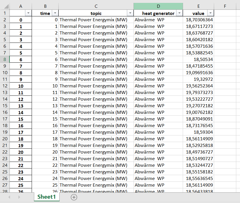
Fig. 3.22 Output excel file structure - differs on the column number
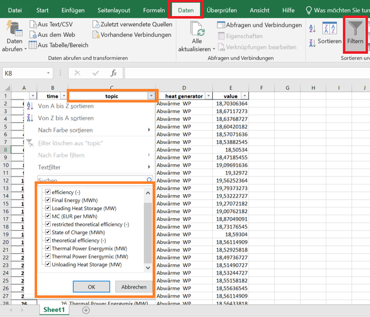
Fig. 3.23 Filter possibility - topic
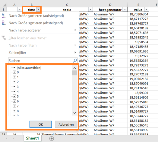
Fig. 3.24 Filter possibility - time
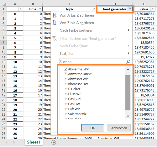
Fig. 3.25 Filter possibility - heat generator
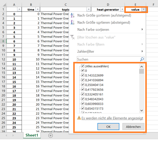
Fig. 3.26 Filter possibility - value